Chincoteague Ponies done as seahorses.
for high quality jpgs of images on these pages or to commission original images email me at [email protected]
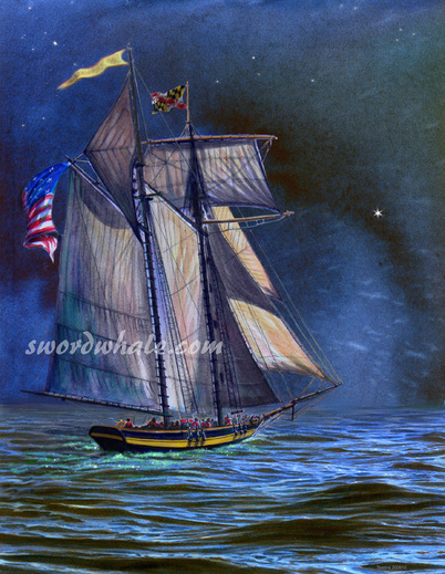
I've played with crayons, oil paint (icky, smelly, gack), pastels, house paint, colorful rocks (powdered and smeared in my sketchbook), sand, mud... my favorite is water. Watercolor sounds like Grandma painting posies, but it's far more. It can be quiet and serene, or noisy and splashy. It's one of the oldest color media. One of the simplest; you can carry a small kit riding, birdwatching, backpacking, kayaking, or roaring on a reach on a pirate ship (just don't drop your palette on the pale, absorbent deck, or you'll be swabbing it). Watercolor can also challenge even the most experienced artist. The illustration of Pride, top, was done from my own photos, experience sailing on her (and at least a few conversations with real crew, as in, "did I get all those things in the right places???"), and one photo from the mom of a crew member (we coincidentally had photos from the same angle, hers with all but one sail up, and mine with just the missing sail up). I did three separate watercolors (the ship, the sky, the water) and combined them on Photoshop.
Several illustrations below were done for parks and environmental organizations.
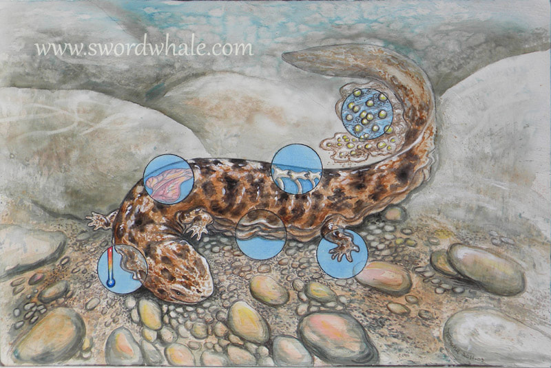
Some, like the hellbender, are done on board using acrylic paints thinned, the technique is watercolory.
A few in the slideshow are Photoshop combos of several watercolors, layered. You can see the original traditional watercolors in other parts of the slideshow.
Hellbender salamander showing what makes an amphibian for Nixon County Park PA


