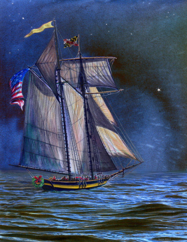
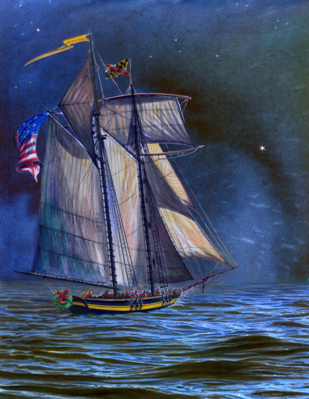
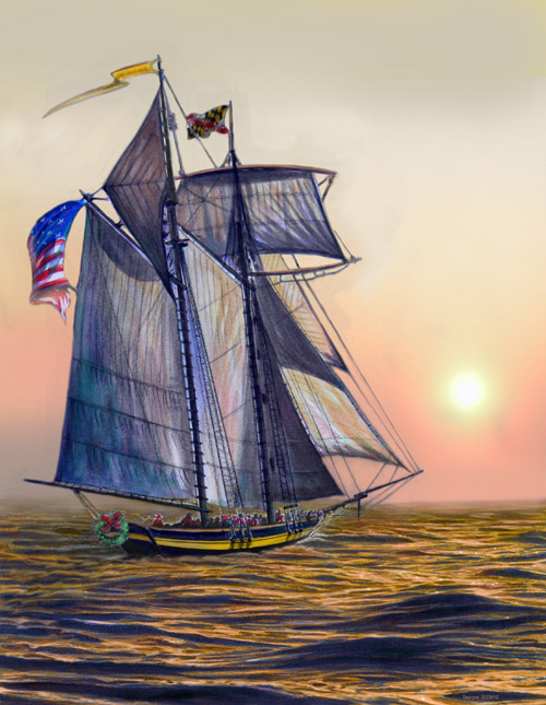
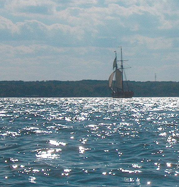
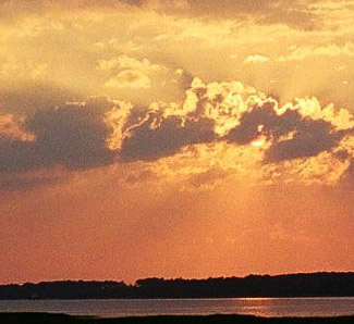
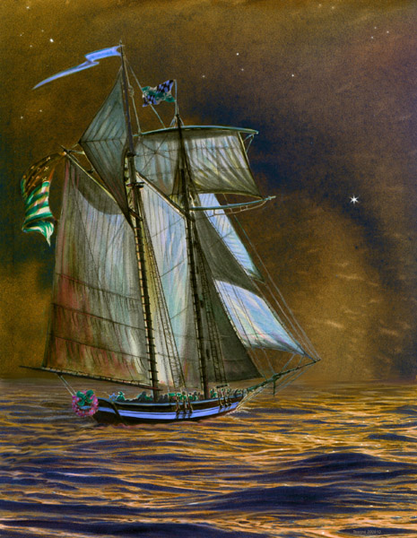
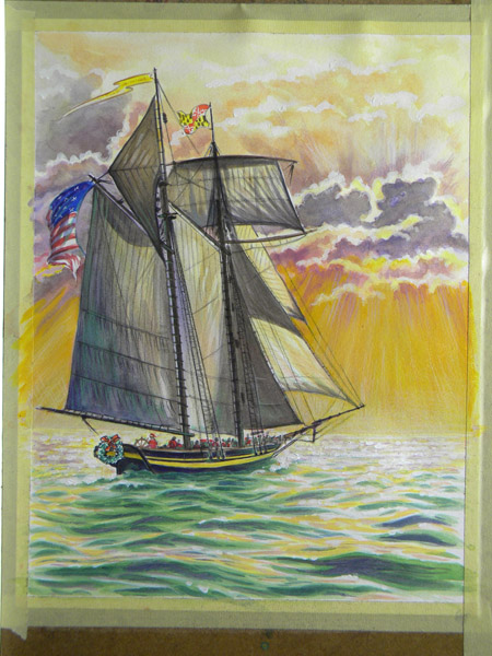
After a discussion with the Pride people (including a Captain who has been with the ship from the beginning and knows every thread and splinter of her), I canned the rather exhuberant watercolor sky for a night sky (a separate watercolor) which put more emphasis on the ship herself. The water is based on shots I took from my kayak of a different ship on the Patuxent River. Then I mangled things in Photoshop, using pics I'd taken of an Assateague beach sunrise, for a morning shot. Tweaking of rigging and those "smiley face" yards (the bottom one bne bends, but not that much), and the golden "Pride" flag led to the illo on the starboard...
|
 the real final finish... |
so go ahead, draw a pirate ship
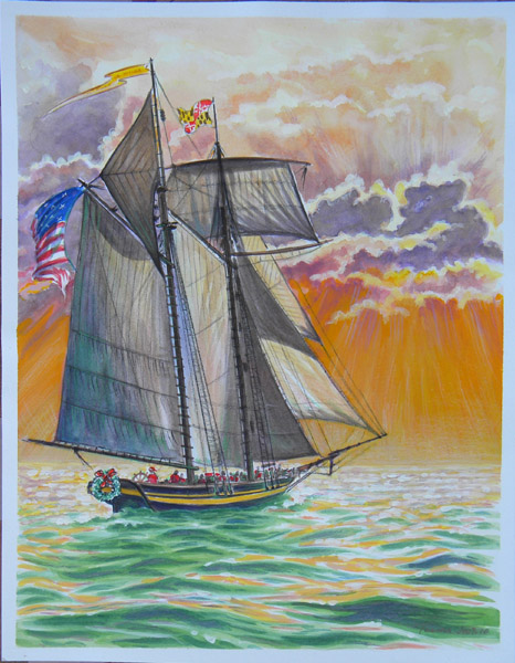 |
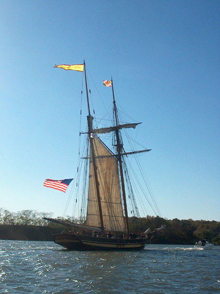
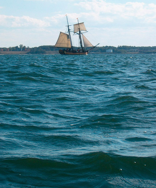
This is an illustration I did of the Pride of Baltimore II, for a holiday card. Pride (if you haven't noticed the pics on the rest of this site) is one of my favorite real ships. She's a reproduction of the wicked swift and agile privateering vessels of the War of 1812. We were a struggling young country with barely any navy, and the Napoleonic War in Europe was taking a toll on our shipping. Our government handed out letters of marque and reprisal to ship owners making them "legal pirates", allowing them to take ships of the enemy, and sell their stuff. The "Baltimore Clippers" as they became known, could outrun what they couldn't outgun, and outgun what they couldn't outrun.
I've sailed on Pride a few times, once for two days as guest crew. I've swabbed her gunnels, checked her bilges, painted a gun door or two, and steered once. And stood (at a sharp angle on the deck, as she heeled on the wind) in wonder as we roared on a reach on a good wind across the Bay. I can doodle a rough sketch from memory, but to do a good illustration, I need some serious reference material and some time. |
here's how I did it...
(click on the pics for a larger view)
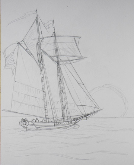
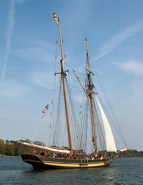
First you need some reference material...
|
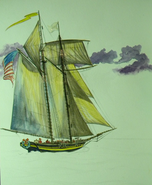
...then you start drawing. Drawing; 9 x 12 vellum bristol paper, taped to a masonite drawing board (so it doesn't wrinkle when I use the watercolor). I like vellum bristol for its weight and smooth (like eggshell) surface; I can do lots of details. I like to work small. First I look for the basic shapes (hull, sails, masts, spars: all just lines and squares and other basic shapes). Then I refine and add detail; below.
 I start adding the watercolor: big shapes first: shadows on the sails, spars (masts, yards, other "sticks") I used acrylic for the blacks (hull, spars) because I can paint right over acrylic without picking it up (watercolor is not waterproof, acrulic is). Acrylic can be used transparent like watercolor, or opaque, like house or craft paint.
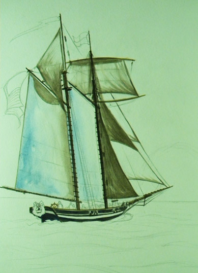 |


 I covered the ship with masking fluid, and began painting the sky over it.
 More sky...
 Decided I didn't want "red sky at morning, sailor take warning" (though it might have been a sunset); too red-green. Used acrylic to create golden sky.
|
 More sky: left pale edges around clouds (yellow watercolor with white paper showing through).
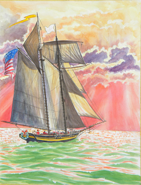 Water shadow, in green. Light on the water in pale red.
 Finish (for now): darker shadows in the water. More white highlights on the water. Details (Prismacolor & acrylic) in clouds and ship. You can see the tape & drawing board here.
|
I shot these with my Nikon Coolpix under various lighting conditions (sun, open shade, flourescent light in the night kitchen), as I did them. This created some interesting conundrums on Photoshop, trying to get the colors correct. Purest watercolorists only use the white paper shining through the transparent paint. I am not a purist. While mixing white paint with watercolor will get you a horrible chalky putrid mess, using acrylics or Prismacolor pencils, or other opaque media can get you some nifty effects. On a recent trip to the art store, I noticed Winsor Newton had water-soluble oil paint: you can thin and mix them with water, avoiding the stinky mess in your kitchen or studio. I can still fiddle this on Photoshop, using the airbrush and other art tools. I can go back to the red sky version, and create a whole 'nother version, or take the ship from this one and place it into a different background. I'm waiting for some feedback from the real sailors, to make sure I haven't left out anything important; like a line that holds the ship together!
